A Paradigm Shift
In 2014, Google had to shark-proof their underwater cables. It turned out that sharks were fond of chewing on the high-speed cables that make up the internet. While these “attacks” are no longer an issue, they are a reminder that both the internet and sharks share the same home.
E-Book →
When you buy a book on Amazon, the environmental consequences are difficult to ignore. From the jet fuel and gasoline burned to transport the packages, to the cardboard boxes cluttering your house, the whole process is filled with reminders that your actions have tangible, permanent consequences. Download that book onto an e-reader, however, and this trail of evidence seems to vanish. The reality is, just as a package purchased on Amazon must be transported through warehouses and shipping centers to get to your home, a downloaded book must be transported from data centers and networks across the world to arrive on your screen.
E-Book →
And that’s the thing: your digital actions are only possible because of the physical infrastructure built to support them. Digital actions are physical ones. This means that Google has to be mindful of sharks. This also means that we should be mindful of the carbon emissions produced by running the world’s data centers and internet networks. According to one study, the Information and Communications Technology sector is expected to account for 3–3.6% of global greenhouse gas emissions in 2020 [1]. That’s more than the fuel emissions for all air travel in 2019, which clocked in at 2.5%. The answer to “why?” and “how?” may not be immediately obvious, but that’s not the fault of consumers. A well-designed, frictionless digital experience means that users don’t need to worry about what happens behind the scenes and, by extension, the consequences. This is problematic: the idea of “hidden costs” runs contrary to principles of environmental awareness. Understanding how these digital products and services work is a crucial first step towards addressing their environmental impact.
A Look at Different Types of Media
Each type of digital activity produces different levels of emissions. The amount of carbon dioxide emitted by a particular digital activity is a factor of the quantity of information that needs to be loaded. More specifically, we can estimate emissions using the following formula:
A byte is a unit for information.
is the global average for energy consumed for transmitting one byte of data in 2015, as calculated by Aslan et al. (2017) [2].
represents the EPA’s U.S. national weighted average for grams of CO₂ emitted for electricity consumed.
Ideally, this formula would also include the energy usage of the data source and your device, but these will vary across digital media providers, users, and activities. This formula therefore provides a reasonable lower bound for emissions.
Websites
In order to load the Parametric Press article that you are currently reading, we estimate that 51 milligrams of CO₂ were produced. The same amount of CO₂ would be produced by driving a car 0.20 meters (based on the fuel economy of an average car, according to the EPA). These emissions are a result of loading data for the text, graphics, and visualizations that are then rendered on your device.
The chart to the rightbelow displays the carbon emitted when loading various websites and scrolling through each at a constant speed for 60 seconds (this scrolling may incur more loading, depending on the site). All data collection was done using a Chrome web browser under a 100mbps Wi-Fi connection. Clicking Tapping each bar in the chart will show a preview of that scroll, sped up to a 5 second clip.
As shown to the rightabove, loading websites like Google, which primarily show text, produces much lower emissions than loading websites like Facebook, which load many photos and videos to your device.
Audio
Let’s take a closer look at one common type of non-text media: audio. When you listen to audio on your device, you generally load a version of the original audio file that has been compressed into a smaller size. In practice, this size is often determined by the choice of bitrate, which refers to the average amount of information in a unit of time.
The NPR podcast shown in the visualization was compressed to a bitrate of 128 kilobits per second (there are 8 bits in a byte), while the song “Old Town Road”, retrieved from Spotify, was compressed to 256 kilobits per second. This means that in the one minute timespan that both audio files were played, roughly twice as much data needed to be loaded for “Old Town Road” than for “Digging into ‘American Dirt’”, which leads to the song having about twice as large of a carbon footprint. The fact that the song has greater carbon emissions is not a reflection on the carbon footprint of songs versus podcasts, but rather the difference in the bitrate of each audio file. These audio examples have lower carbon emissions than most of the multimedia websites shown earlier.
Video
Videos are a particularly heavy digital medium. The chart to the rightbelow shows emissions for streaming different YouTube videos at two different qualities—360p and 1080p, for 60 seconds each.
When you view a video at a higher quality, you receive a clearer image on your device because the video that you load contains more pixels. Pixels are units of visual information. In the chart, the number in front of the “p” for quality refers to the height, in pixels, of the video. This is why there are greater emissions for videos at 1080p than those at 360p: more pixels means more data loaded per frame.
Bitrate also plays a role in video streaming. Here, bitrate refers to the amount of visual and audio data loaded to your device over some timespan. From the chart, it is clear that the “Old Town Road” music video has a higher bitrate than the 3Blue1Brown animation at both qualities. This difference could be attributed to a variety of factors, such as the frame rate, compression algorithm, and the producers’ desired video fidelity.
In the examples provided, videos produced far more CO₂ than audio over the same time span. This is especially apparent when comparing the emissions for the audio of “Old Town Road” and its corresponding music video.
Not only does a video require loading both audio and visual data, but visual data is also particularly heavy in information. Notice that loading the website Facebook produced the most emissions, likely a result of loading multiple videos and other heavy data.
Packets
In a lot of cases, when you stream content online, you don’t receive all of the information for that content at once. Instead, your device loads incremental pieces of the data as you consume the media. These pieces are called packets. In each media emission visualization, we estimated emissions based on the size and quantity of the packets needed to load each type of media.
Click Tap the “Show Timeline” button at the bottom of the visualization to the rightbelow to see a timeline breakdown of each type of media.
In this timeline breakdown, we can see that the way in which packets arrive for video and audio differs from the pattern for websites. When playing video and audio, packets tend to travel to your device at regular intervals.
In contrast, the packets for websites are weighted more heavily towards the beginning of the timeline, but websites may make more requests for data as you scroll through and load more content.
A Case Study: YouTube’s Carbon Emissions
We’ve just seen how digital streams are made up of packets of data sent over the internet. These packets aren’t delivered by magic. Every digital streaming platform relies on a system of computers and cables, each part consuming electricity and releasing carbon emissions. When we understand how these platforms deliver their content, we can directly link our digital actions to the physical infrastructure that releases carbon dioxide.
Let’s take a look at YouTube. With its 2 billion + users, YouTube is the prototypical digital streaming service. How does one of its videos arrive on your screen?
Videos are stored on servers called “data centers”: warehouses full of giant computers designed for storing and distributing videos. For global services, these are often placed around the world.
YouTube’s parent company, Google, has 21 origin data centers strategically placed throughout 4 continents (North America, South America, Europe, and Asia).
Let’s take a closer look at one of these origin data centers. This one is in The Dalles, Oregon, on the West Coast of the United States.
For information to get from this data center to you, it first goes through Google’s own specialized data network to what they call Edge Points of Presence (POPs for short), which bring data closer to high traffic areas. There are three metro areas with POPs in this region: Seattle, San Francisco, and San Jose.
From these POPs, data is routed through smaller data centers that form the “Google Global Cache” (GGC). These data centers are responsible for storing the more popular or recently watched videos for users in a given area, ensuring no single data center is overwhelmed and service stays zippy. There are 22 in the region shown on the map. A more general term for this collection of smaller data centers is a Content Delivery Network (CDN for short).
In 2018, researchers from the University of Bristol used publically available data to estimate the energy consumption of each step of YouTube’s pipeline in 2016.
Google does not disclose its data center energy consumption for YouTube traffic specifically. Therefore, Chris Preist, Daniel Schien and Paul Shabajee used the energy consumption numbers released for a similar service’s (Netflix) data centers to estimate YouTube’s data center energy consumption. They found that all data centers accounted for less than 2% of YouTube’s electricity use in 2016 [3].
Google doesn’t have their own network for communication between POPs and the Google Global Cache. For that, they use the internet.
The internet is a global “highway of information” that allows packets of data to be transmitted as electrical impulses. A packet is routed from a source computer, through cables and intermediary computers, before arriving at its destination. In addition to the 550,000 miles of underwater cables that form the backbone of the internet, regions have their own land-based networks.
Here’s (roughly) what the major internet lines of the west coast look like [4]. Perhaps not surprisingly, it resembles our interstate highway system. Preist et al. estimate that this infrastructure consumed approximately 1,900 Gigawatt-hours of electricity to serve YouTube videos in 2016 [3], enough to power 170,000 homes in the United States for a year, according to the EIA.
The packets traveling across this information highway need “off-ramps” to reach your screen. The off-ramps that packets take are either “fixed line” residential networks (wired connections from homes to the internet) or cellular networks (wireless connections from cell phones to the internet). The physical infrastructure making up these two types of networks differ, and therefore have distinct profiles of energy consumption and carbon emissions.
An estimated 88% of YouTube’s traffic went through fixed line networks (from your residential Cable, DSL, or Fiber-Optic providers), and this accounted for approximately 4,400 Gigawatt-hours of electricity usage [3]—enough to power over 400,000 U.S. homes.
In comparison, only 12% of YouTube’s traffic went through cellular networks, but they were by far the most expensive part of YouTube’s content delivery pipeline, accounting for approximately 8,500 Gigawatt-hours of electricity usage—enough to power over 750,000 U.S. homes [3]. At over 10 times the electricity usage per unit of traffic, the relative inefficiency of cellular transmission is clear.
Eventually, the video data reaches your device for viewing. While your device might not technically be part of YouTube’s content delivery pipeline, we can’t overlook the cost of moving those pixels. Devices accounted for an estimated 6,100 Gigawatt-hours of electricity usage [3]: that’s over half a million U.S. homes worth of electricity.
In total, Preist et al.’s research estimated that YouTube traffic consumed 19.6 Tetrawatt-hours of electricity in 2016 [3]. Using the world emissions factor for electricity generation as reported by the International Energy Agency, they place the resulting carbon emissions at 10.2 million metric tons of CO₂ (offset to 10.1 after Google’s renewable energy purchases for its data center activities).
YouTube emitted nearly as much CO₂ as a metropolitan area like Auckland, New Zealand did in 2016. Put in other words, 10.2 MtCO₂ is equivalent to the yearly footprint of approximately 2.2 million cars in the United States.
YouTube’s monthly active user count has since increased by a minimum of 33% since 2016, (from 1.5 billion a year later in 2017 to over 2 billion last year in 2019). This means its current CO₂ emissions in 2020 could be even higher than Preist et al.’s 2016 prediction.
If we assume that the emissions factor for electricity usage is similar for each part of the pipeline, we can get a rough idea of the carbon footprint profile of YouTube. However, it’s important to note that this breakdown isn’t necessarily representative of the entirety of the information and technology sector. A 2018 study by McMaster University researchers Lotfi Belkhir and Ahmed Elmeligi paints a surprisingly different picture for the sector as a whole [1].
To compare the two studies, we can group the “Internet”, “Residential Network”, and “Cellular Network” sections into an umbrella “Networks”.
Belkhir and Elmeligi provide emission estimates for both 2010 (retrospective) and 2020 (prospective). Most surprising is the weight Data Centers and CDNs have in this breakdown. We can speculate that the relatively high bandwidth required to transfer videos as a medium contributes at least partially to the overweightedness of the “Networks” category for YouTube.
In the same study, Belkhir and Elmeligi created two models to project the ICT sector’s emissions decades forward. Even their “unrealistically conservative” linear model put tech at a 6–7% share of GHG emissions in 2040, and their exponential model had tech reaching over 14%.
What is being done about this? Aside from increasing the efficiency of each part of the pipeline and taking advantage of renewable energy, mindful design could also go a long way.
In the context of digital streaming, Preist et al. point out that much of YouTube’s traffic comes from music videos, and a good number of those “views” are likely just “listens”. If this “listen” to “view” ratio were even just 10%, YouTube could have reduced its carbon footprint by about 117 thousand tons of CO₂ in 2016, just by intelligently sending audio when no video is required. That’s over 2.2 million gallons of gasoline worth of CO₂ in savings.
Tech’s Inconvenient Truths
Digital streaming is not the only instance where environmentally harmful aspects of technology are outside of public consciousness. Tech is rarely perceived as environmentally toxic, but here’s a surprising fact: Santa Clara County, the heart of “Silicon Valley”, has the most EPA classified “superfund” (highly polluted) sites in the nation. These 23 locations may be impossible to fully clean. Silicon Valley is primarily to blame.
In their book The Silicon Valley of Dreams, David Pellow & Lisa Park detail how Santa Clara County became “Silicon Valley” in the 1960s when companies in the area found ways to embed computer circuits into small wafers of silicon. Manufacturing these chips is inherently toxic, and its chemical runoff has been linked to increases in cancer and birth defect rates around the Bay. However, the industry avoided responsibility for decades and actually cultivated a clean image, publicizing their pristine campuses and white-collar workforce [5].
Change in Silicon Valley never came easily. In the 1980s, residents around the Bay took matters into their own hands, mapping out patterns of illnesses around factories and formed environmental coalitions. It wasn’t until this public outcry that one of the largest Silicon Valley manufacturers closed down a particularly problematic factory [5]. For the first time, a tech company admitted responsibility for manufacturing-related illnesses, blowing a hole in the industry’s clean facade. In the decades that followed, factories began shutting down as manufacturing moved out of Silicon Valley, but their environmental impact is still being felt today, primarily by working-class communities of color. A study done in 2014 by researchers from Santa Clara University found that “social vulnerability, cumulative environmental hazards, and environmental benefits exhibit distinct spatial patterns in [Santa Clara County]” [6].
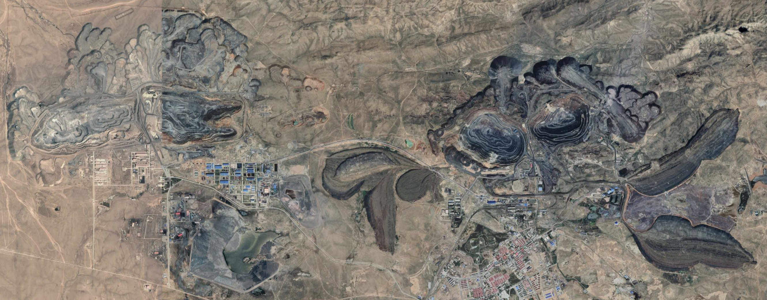
The tech industry’s legacy of toxic mining and manufacturing continues today—with hardware giants like Apple taking the throne of Silicon Valley’s founding industrialists—only now on a global scale. In 2009, China produced 95% of the world’s “rare earth” minerals, with an estimated 70% coming from the Bayan Obo mining district in Inner Mongolia. In her book Rare Earth Frontiers, Julie Klinger discusses how the process of mining “rare earth” minerals releases contaminated water into the Yellow River, Bayan Obo’s local water supply. The local population has suffered devastating effects, as farmland has turned to lakes of toxic waste, and cancer related deaths have spiked. Since 2004, villagers have organized to compel the government to take action. While the state has not fully fixed the devastation it’s caused, it has responded to public pressure by removing some of the toxic waste and providing the people of Bayan Obo better access to healthcare [7].
Tech’s complicity in environmental destruction is not just limited to toxic manufacturing waste and a large carbon footprint. Companies also have a large influence on the climate crisis in the context of policy, the broader economy, and the flow of information. Reports in 2019 revealed that Google has made significant contributions to climate denialist groups, including the Competitive Enterprise Institute (CEI), which helped convince the Trump administration to withdraw from the Paris Agreement in 2017. Facebook has come under fire for lax action against climate change denial on their platform, where disinformation can easily spread without diligent fact-checking. Google, Microsoft, and Amazon have partnered with large oil companies to build machine learning tools that streamline oil production. In fact, the oil industry invested an estimated $1.75 billion in 2018 into machine learning tools, which is projected to grow to $4.01 billion by 2025.
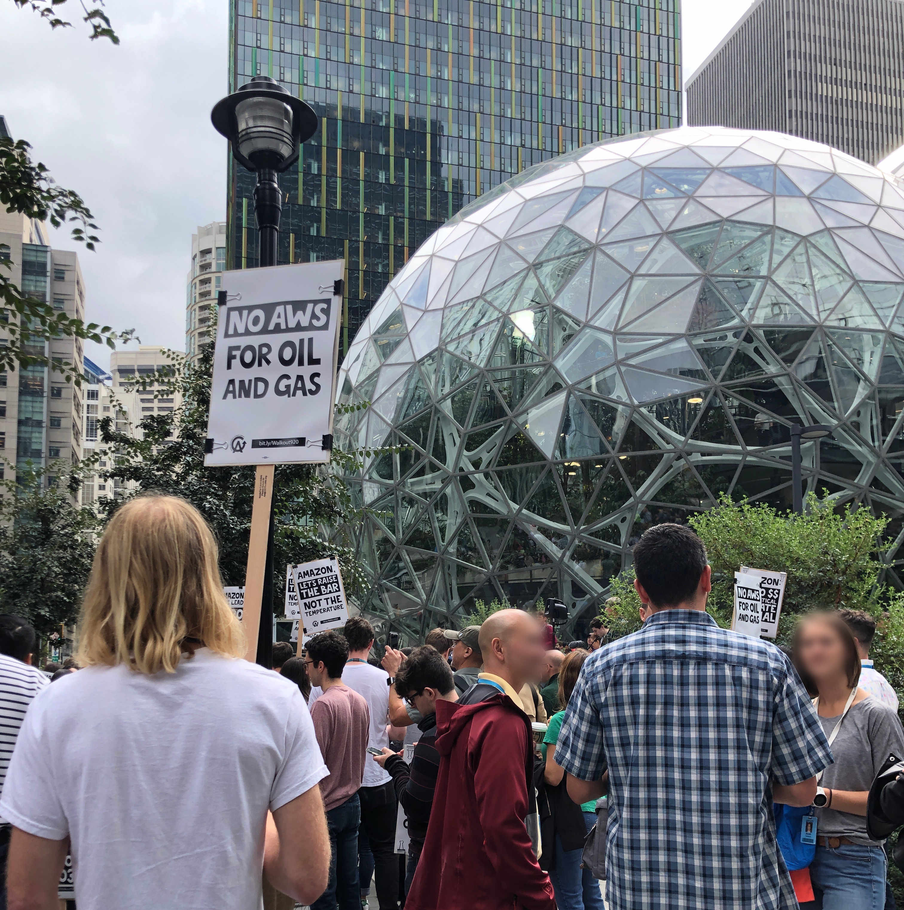
Our purpose in throwing light onto this destructive behavior is not simply to paint a bleak future. Through public pressure and the collective organizing of tech employees, there has been media coverage of some success in holding the tech industry responsible for their environmental destruction. In 2019, after the Amazon Employees for Climate Justice organization led a large walkout in support of the global climate strike, Amazon pledged to reach net-zero carbon emissions by 2040. Similarly, in response to employee pressure, Google pledged to stop funding climate change deniers in 2020. Google also promised to rescind all future contracts with oil companies in response to a Greenpeace report about tech’s oil contracts.
Regarding digital consumption and its associated emissions, many tech companies have set varying carbon footprint targets for 2030 and beyond. Some of these companies will rely on offsetting carbon emissions (e.g., by planting trees). Others plan to run their operations completely on carbon-free energy sources. It’s important to note, however, that these pledges often don’t include emissions produced by usage from sources the company doesn’t “own” but is ultimately responsible for. For example, Google pledging carbon-free doesn’t mean the YouTube videos sent over the internet and viewed on devices will be emission-less.
The efficacy of carbon offsets is debated: there are no guarantees that carbon offsets actually result in the desired amount of greenhouse gas removed from the atmosphere, and it is never instantaneous.These pledges are not enough to fully mitigate these companies’ destructive practices. In our present climate crisis, carbon reductions cannot come soon enough, and carbon free technology should be the ultimate goal. In addition, they don’t account for the climate impact tech has through the other avenues we’ve discussed. The good news is that public pressure and collective organizing have the power to raise the bar for climate accountability—change can only occur if we understand and acknowledge the hidden, yet harmful consequences of the technology we use.
References
- Assessing ICT global emissions footprint: Trends to 2040 & recommendations, Lotfi Belkhir and Ahmed Elmelgi. Journal of Cleaner Production. March 2018.
- Electricity Intensity of Internet Data Transmission: Untangling the Estimates, Joshua Aslan, Kieren Mayers, Jonathan G. Koomey, and Chris France. Journal of Industrial Ecology. August 2017.
- Evaluating Sustainable Interaction Design of Digital Services: The Case of YouTube, Chris Preist, Daniel Schien, and Paul Shabajee. CHI. 2019.
- InterTubes: A Study of the US Long-haul Fiber-optic Infrastructure, Ramakrishnan Durairajan, Paul Barford, Joel Sommers, and Walter Willinger. SIGCOMM '15. 2015.
- The Silicon Valley of Dreams: Environmental Injustice, Immigrant Workers, and the High-Tech Global Economy, David N. Pellow and Lisa Sun-Hee Park. December 2002.
- The uneven distribution of environmental burdens and benefits in Silicon Valley's backyard, Iris T.Stewart, Christopher M.Bacon, and William D.Burke. Applied Geography. December 2014.
- Rare Earth Frontiers: From Terrestrial Subsoils to Lunar Landscapes, Julie Michelle Klinger. 2017.